It came to a close two weeks ago. Over two weeks of obsessive watching everything that moves on skis, skates or boards. My tiny country of the Netherlands won about half of all the medals at the speed skating events. Since there are many medals to be won here this made it to end up high in the medal table. This makes it look as winter sports nation, where all we skating buffs. (Sadly, we can’t hardly skate anymore last years. Stop global warming everyone, the Dutch need their ice!) To me, this begged the question, are other top nations also in the high ranks because they dominate a single sport. Or are they all round snow and ice eating badasses?
Looking at the medals
Lets take the top ten of the medal table. Now, the rank on the medal table is primarily determined by the number of golds a nation takes. The silvers and bronzes are only taken into account when there are ties. I think that silvers and bronzes should also have some weight. We first visualize all the medals for the top ten.
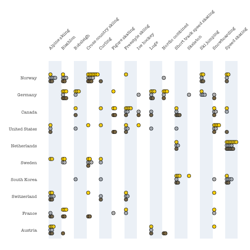
We see that there is no country is so one-dimensional as the Netherlands. All others, even the ones lower at the table, toke medals at at least four different sports. Which countries are successfull in many sports, and which dominate a few big ones? This is not so easy to tell from this plot, maybe aside from a few countries taking many golds in one sport. Lets calculate a weighted score for each of the sport-country combinations. Winning a gold will add three points to the score, a silver two, and a bronze one. This results in a score for each sport in which the country took at least one medal. We order the scores within each country high to low and plot them in the Olympic towers plot below.
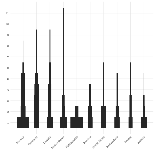
The Netherlands on speed skating has the highest score, with 34 points, with Norway on the cross-country skiing a close second with 32. These are true diggers in a single mine. Norway did great in four other sports as well, leading to the best achievement by a single country at the winter Olympics ever. Germany also seemed to dominate a few sports. Canada and the USA show a different picture. They are, with Germany, the most diverse countries in the field. With the USA claiming medals in as many as eleven sports (out of a total of fifteen). However, they both have only one sport in which they have a weighted score of ten or more. Where Norway and Germany both have four sports with at least ten medal points. The Netherlands are true one-trick-ponies with respect to the winter Olympics. Only getting medals at the speed skating and short track. Numbers six to ten of the table show some variation in more specialized (Sweden) and more broad (France).
Which countries are most alike
Now, we have seen the raw data in a visualization and we checked if countries are dominating sports, took medals at many different sports, or did both. Now the final question is, which countries are most alike? Even with such a small data set (10 countries, 15 sports) it is already a challenge to do such a clustering just based on the appearance of the medal plot. Luckily there is PCA to come the rescue. (If you are not familiar with PCA, here is the formidable Julia Silge explaining the thing.)
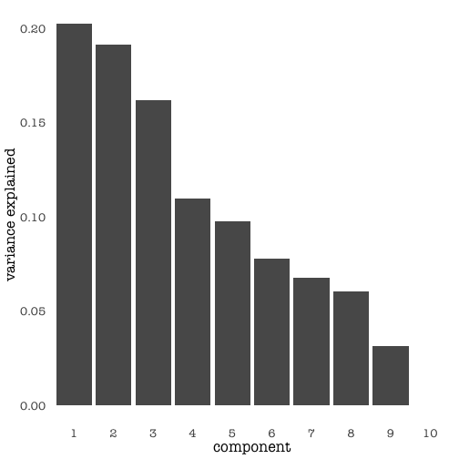
We start by checking the amount of variance explained by each component. The first two explain about 40%. There is no clear elbow, implying that also higher components will provide us with information. A great advantage of doing of having few rows and columns in the original data is that we can plot both the countries and the sports in a biplot. We start by looking at the first two components.
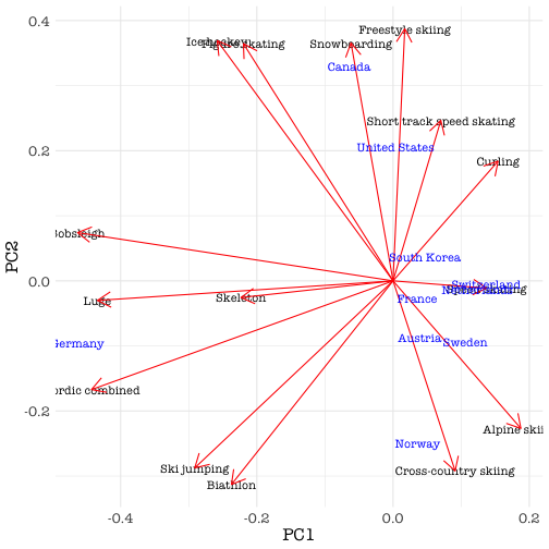
The first PC is clearly a Germany axis. We already noticed Germany is dominant in a number of sports and it appears it does not have much rivalry in them. The “track” sports bobsleigh, skeleton and luge plus the nordic combined are mainly German affairs. The second PC (with almost as much explained variance as the first) is a Norway versus Canada/USA axis. Of course having the cross-country pointing in the direction of Norway, but also the alpine skiing. Canada and the USA rule the snowboarding, figure skating, ice hockey, freestyle skiing and short track. Since the Norwegians and Germans both are great at ski jumping and biathlon these load on both PC1 and PC2. The first PCs are obviously and naturally dominated by the four biggest winners. The Germans toke a gold in the figure skating and a silver in the ice hockey, so these two sports load a little bit on PC1 as well.
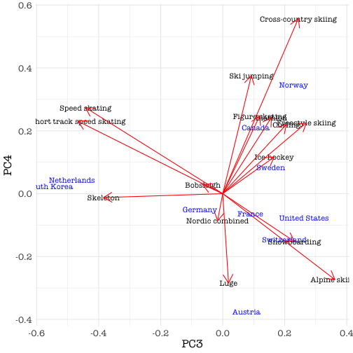
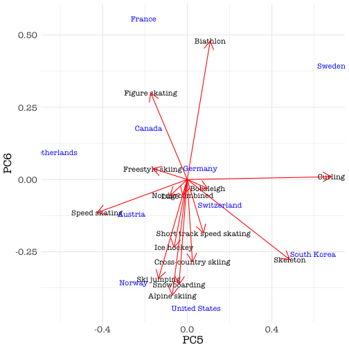
The third PC is a speed skating versus alpine sports axis, clearly clustering South Korea and the Netherlands as the skating nations. PCs 4, 5, 6 are more nuancing components. For instance stressing the differences between the USA and Canada. This draws the attention to the fact that Canada did not win any medals in the alpine skiing. This is very interesting, why does Canada do well on all the alpine disciplines except the skiing? You would expect them to be good skiers. PC4 and PC6 show that Canada and USA both have some but different overlap with Norway. The smaller PCs do justice to the performances of the countries in the lower half of the top ten. Each did will in a different sport in which also one of the top countries was a force.
And now we wait
It is a two-and-a-half year wait to the next Olympics, this concludes this year’s winter games. Even though we analyzed a very small data set, with only ten rows and fifteen observations there was so much to explore. Norway was a dominant force this year, claiming medals in sports in which it also had fierce competition from other countries. Germany completely dominated a number of events, all by itself. The USA and Canada are not only geographically, but also athletically, much alike and are true winter sports all rounders. The Netherlands and South Korea, may be culturally very different, but they together were ruling the ice skating on long and short track. The European alpine countries plus Sweden are mainly a force on the snow events, each with their own specialties.
These are the results of this analysis. Creating it involved web scraping, data munging, data visualization and statistical analysis. I plan on two follow-up blogs in which we will elaborate on how to get and clean the data and how to creatively use ggplot2 to build a custom visualization. If you can’t wait, the source code of the blog is available on github.
comments powered by Disqus