The functionality has been implemented in the function ggoutlier_hist in the ggoutlier package, which you can find here https://github.com/EdwinTh/ggoutlier. Please use this as your source, this is where the code will be maintained.
I guess we all use it, the good old histogram. One of the first things we are taught in Introduction to Statistics and routinely applied whenever coming across a new continuous variable. However, it easily gets messed up by outliers. Putting most of the data into a single bin or a few bins, and scattering the outliers barely visible over the x-axis. This distribution might look familiar
library(tidyverse)
set.seed(42)
hist_data <- tibble(x = c(rexp(1000, .5),
                          runif(50, 0, 500)))

ggplot(hist_data, aes(x)) +
  geom_histogram(binwidth = .1, col = "black", fill = "cornflowerblue")
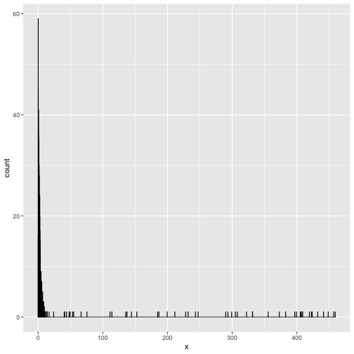
Two strategies that make the above into something more interpretable are taking the logarithm of the variable, or omitting the outliers. Both do not show the original distribution, however. Another way to go, is to create one bin for all the outlier values. This way we would see the original distribution where the density is the highest, while at the same time getting a feel for the number of outliers. A quick and dirty implementation of this would be
hist_data %>%
  mutate(x_new = ifelse(x > 10, 10, x)) %>%
  ggplot(aes(x_new)) +
  geom_histogram(binwidth = .1, col = "black", fill = "cornflowerblue")
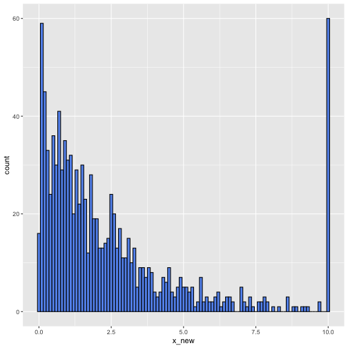
Not bad. However, it now suggests incorrectly that many observations are exactly 10. I routinely make these plots for my own information, but they cannot be shared without explaining what happened to the outliers and what there original range was. Since a plot with a manual is not that great either, I recently did a hacking session into the ggplot object. The resulting gg_outlier_bin function not only indicates the range of the last bin, it also allows for a different fill color of the bin. Now we are clearly distinguishing the outlier aggregation
gg_outlier_bin(hist_data,
               "x",
               cut_off_ceiling = 10,
               binwidth = 0.1)
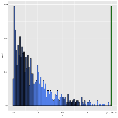
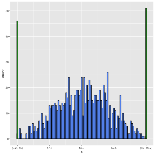
It is still a bit experimental, but it seems to work in most situations. Below you find the function code for making histograms with outlier bins. You can also get it by installing the package accompanying this blog devtools::install_github("edwinth/thatssorandom"). By the way, it works on both floor and ceiling outliers. Like in the following
data_frame(x = c(runif(100, 0, 100), rnorm(1000, 50, 2))) %>%
  gg_outlier_bin("x", 45, 55, binwidth = .1)
## Warning: `data_frame()` is deprecated as of tibble 1.1.0.
## Please use `tibble()` instead.
## This warning is displayed once every 8 hours.
## Call `lifecycle::last_warnings()` to see where this warning was generated.
gg_outlier_bin <- function(x,
                            var_name,
                            cut_off_floor     = NA_real_,
                            cut_off_ceiling   = NA_real_,
                            col               = "black",
                            fill              = "cornflowerblue",
                            fill_outlier_bins = "forestgreen",
                            binwidth          = NULL) {

  hist_input_checking(x,
                      var_name,
                      cut_off_floor,
                      cut_off_ceiling,
                      col,
                      fill,
                      fill_outlier_bins,
                      binwidth)

  printing_min_max <- get_printing_min_max(x, var_name)

  regular_x <- filter_regular_x(x, var_name, cut_off_floor, cut_off_ceiling)

  plot_obj <- ggplot2::ggplot(regular_x, ggplot2::aes_string()) +
    ggplot2::geom_histogram(col = col, fill = fill, binwidth = binwidth)

  if (!is.na(cut_off_ceiling)) {
    x_ceil            <- x[x[[var_name]] >= cut_off_ceiling, var_name, drop = FALSE]
    x_ceil[, 1]       <- cut_off_ceiling
    ticks_for_ceiling <- update_tickmarks_ceiling(plot_obj, cut_off_ceiling,
                                                  printing_min_max[2])
    plot_obj <- plot_obj +
      ggplot2::geom_histogram(data = x_ceil,
                              fill = fill_outlier_bins,
                              col = col,
                              binwidth = binwidth) +
      ggplot2::scale_x_continuous(breaks = ticks_for_ceiling$tick_positions,
                                  labels = ticks_for_ceiling$tick_labels)
  }

  if (!is.na(cut_off_floor)) {
    x_floor         <- x[x[[var_name]] <= cut_off_floor, var_name, drop = FALSE]
    x_floor[, 1]    <- cut_off_floor
    ticks_for_floor <- update_tickmarks_floor(plot_obj, cut_off_floor,
                                              printing_min_max[1])
    plot_obj <-
      suppressMessages(
        plot_obj +
          ggplot2::geom_histogram(data = x_floor,
                                  fill = fill_outlier_bins,
                                  col = col, binwidth = binwidth) +
          ggplot2::scale_x_continuous(breaks = ticks_for_floor$tick_positions,
                                      labels = ticks_for_floor$tick_labels)
      )
  }
  plot_obj
}


hist_input_checking <- function(x,
                                var_name,
                                cut_off_floor,
                                cut_off_ceiling,
                                col,
                                fill,
                                fill_outlier_bins,
                                binwidth) {

  stopifnot(is.data.frame(x),
            is.character(var_name),
            is.numeric(cut_off_floor),
            is.numeric(cut_off_ceiling),
            is.character(col),
            is.character(fill),
            is.character(fill_outlier_bins))

  if (!var_name %in% colnames(x)) {
    stop(sprintf("%s is not a column in x", var_name))
  }

  if ( is.na(cut_off_floor) & is.na(cut_off_ceiling)) {
    stop("Neither cut_off_floor, nor cut_off_ceiling are specified")
  }

  if ( !is.na(cut_off_floor) && !is.na(cut_off_ceiling) ) {
    if (cut_off_floor >= cut_off_ceiling) {
      stop("cut_off_floor should be smaller than cut_off_ceiling")
    }
  }

  if (!is.na(cut_off_floor)) {
    if (cut_off_floor < min(x[[var_name]])) {
      stop(sprintf("cut_off_floor lower than the lowest value in %s",
                   var_name))
    }
    if (cut_off_floor > max(x[[var_name]])) {
      stop(sprintf("cut_off_floor higher than the highest value in %s",
                   var_name))
    }
  }

  if (!is.na(cut_off_ceiling)) {
    if (cut_off_ceiling < min(x[[var_name]])) {
      stop(sprintf("cut_off_ceiling lower than the lowest value in %s",
                   var_name))
    }
    if (cut_off_ceiling > max(x[[var_name]])) {
      stop(sprintf("cut_off_ceiling higher than the highest value in %s",
                   var_name))
    }
  }
}

get_printing_min_max <- function(x, var_name) {

  var <- x[[var_name]]
  c(min = round(min(var, na.rm = TRUE), 1),
    max = round(max(var, na.rm = TRUE), 1))
}

filter_regular_x <- function(x,
                             var_name,
                             cut_off_floor = NA_real_,
                             cut_off_ceiling = NA_real_) {
  x_var <- x[[var_name]]
  ind   <- rep(TRUE, length(x_var))
  if (!is.na(cut_off_floor)) ind[x_var <= cut_off_floor] <- FALSE
  if (!is.na(cut_off_ceiling)) ind[x_var >= cut_off_ceiling] <- FALSE
  x[ind, var_name, drop = FALSE]
}

update_tickmarks_ceiling <- function(plot_obj,
                                     cut_off,
                                     max_print) {
  ranges <- suppressMessages(
    ggplot2::ggplot_build(plot_obj)$layout$panel_params[[1]]$x)
  label_to_add <- sprintf("(%s , %s)", round(cut_off, 1), max_print)
  tick_positions <- ranges$get_breaks()
  tick_labels    <- ranges$get_labels()
  if (overlap_ceiling(tick_positions, cut_off)) {
    tick_positions <- tick_positions[-length(tick_positions)]
    tick_labels    <- tick_labels[-length(tick_labels)]
  }
  return(list(tick_positions = c(tick_positions, cut_off),
              tick_labels    = c(tick_labels, label_to_add)))
}

overlap_ceiling <- function(positions, cut_off) {
  positions <- positions[!is.na(positions)]
  n <- length(positions)
  ticks_dif <- positions[n] - positions[n-1]
  (cut_off - positions[n]) / ticks_dif < 0.25
}

update_tickmarks_floor <- function(plot_obj,
                                   cut_off,
                                   min_print) {
  ranges <- suppressMessages(
    ggplot2::ggplot_build(plot_obj)$layout$panel_params[[1]]$x)
  label_to_add <- sprintf("(%s , %s)", min_print, round(cut_off, 1))
  tick_positions <- ranges$get_breaks()
  tick_labels    <- ranges$get_labels()

  if (overlap_floor(tick_positions, cut_off)) {
    tick_positions <- tick_positions[-1]
    tick_labels    <- tick_labels[-1]
  }
  return(list(tick_positions = c(cut_off, tick_positions),
              tick_labels    = c(label_to_add, tick_labels)))
}

overlap_floor <- function(positions, cut_off) {
  positions <- positions[!is.na(positions)]
  ticks_dif <- positions[2] - positions[1]
  (positions[1] - cut_off) / ticks_dif < 0.25
}
